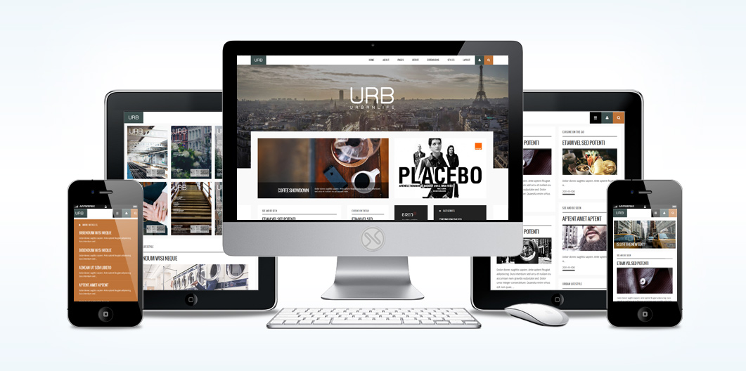
Urban Life
A Premium Joomla Template
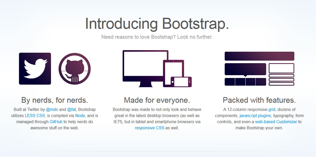
XTC Framework 2.0: Built on Bootstrap
Bootstrap is a Sleek, intuitive, and powerful front-end framework for faster and easier web development. We use a new responsive, fluid grid system to create seamless, responsive layouts. By using the core Bootstrap and custom break points, our responsive design is as dynamic as possible using only CSS3 media queries.
Bootstrap also provides styles for common HTML elements like typography, code, tables, forms, and buttons. It also includes Glyphicons, a great little icon set, as well as the Font Awesome icon set for even more font based icons.
The XTC Bootstrap grid utilizes 12 columns, allowing you to create a fluid AND responsive layout. With the responsive grid in, the layout will adapt to any screensize. The columns become fluid and stack vertically, and each column will adapt to the available size it should have ensuring proper proportions all devices.
Media queries allow for custom CSS based on a number of conditions—ratios, widths, display type, etc—but usually focuses around min-width and max-width.
- Modify the width of column in our grid
- Stack elements instead of float wherever necessary
- Resize headings and text to be more appropriate for devices
Use media queries responsibly and only as a start to your mobile audiences. For larger projects, do consider dedicated code bases and not layers of media queries.
Template Features
Specifications:
- 4 Preset Styles
- 70+ Module Positions
- 60+ Stock Module Suffix Styles
- 2 Mootools based Menu Styles - Suckerfish & DualFish
- Commented source files
- Cross Browser Support for IE9, Firefox, Opera, Safari and Chrome.
Advanced Features:
- XTC Template Framework
- Tableless Template Design
- Responsive Grid
- Bootstrapped Template
- Article Sidebars
- Mulitple Layout Options
- Custom Joomla Content Overides
Package Includes:
- JoomlaXTC Quickstart Installer
- JoomlaXTC Club Template
- JoomlaXTC Extensions